Web applications are normally data-driven and oftentimes the need arises to visualize this data. That’s where charts and graphs come in. They make it easier to convey information, as well as demonstrate correlations or statistical relationships. Information presented in the form of a chart or a graph is also easier for a non-native speaker to understand.
In this tutorial, we’ll learn how to visualize data in a Vue project. For this, we’ll be using the popular D3.js library, which combines powerful visualization components and a data-driven approach to DOM manipulation.
Let’s get started.
Note: the code for this tutorial can be found on GitHub.
What is D3?
As you can read on the project’s home page, D3.js is a JavaScript library for manipulating documents based on data. D3 helps you bring data to life using HTML, SVG, and CSS. Its emphasis on web standards gives you the full capabilities of modern browsers without tying yourself to a proprietary framework.
Whereas most people will refer to D3.js as a data visualization library, it’s not. D3 is more of a framework comprising different parts — such as jQuery parts (which help us select and manipulate DOM elements), Lodash parts, animation parts, data analysis parts, and data visualization parts.
In this tutorial, we’ll be working with the visualization aspect of D3. The real meat of D3 when visualizing data is:
- the availability of functions for decorating data with drawing instructions
- creating new drawable data from source data
- generating SVG paths
- creating data visualization elements (like an axis) in the DOM from your data and methods
What We’ll Be Building
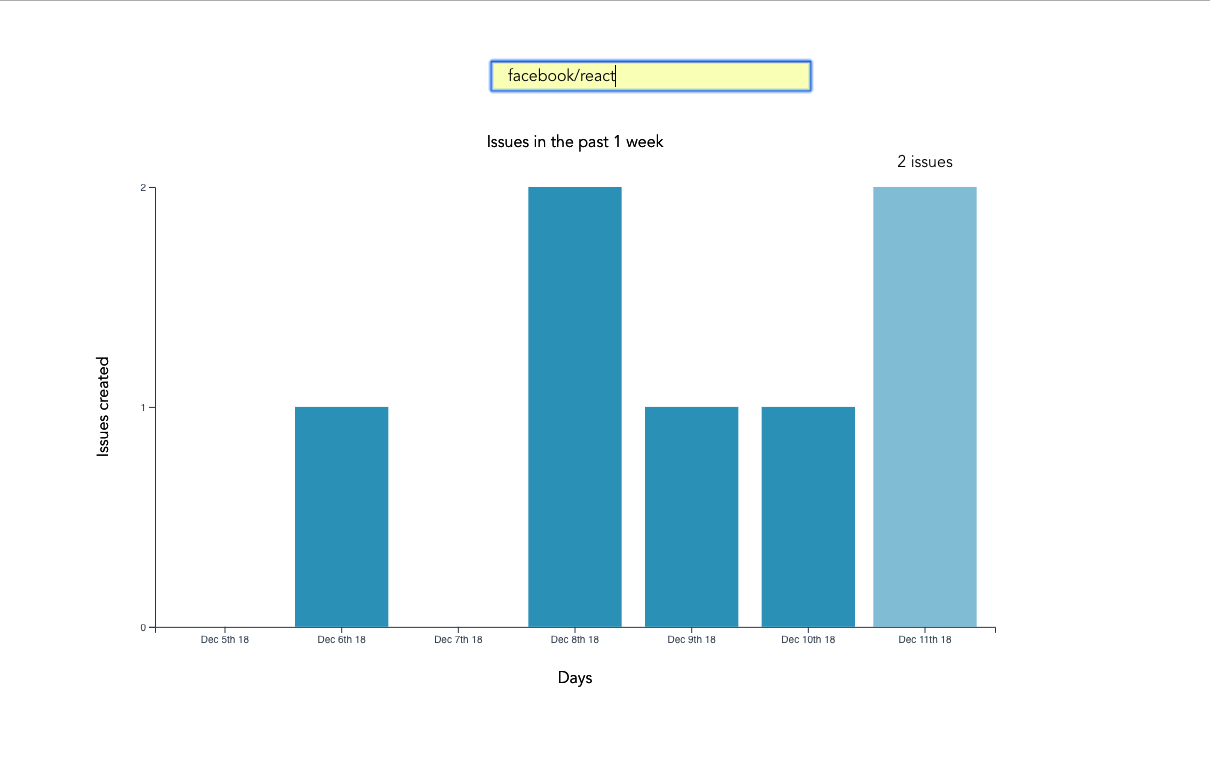
We want to create an app that lets users search for a repo on GitHub, then get a visual representation of issues opened in the past week that are still open. The end result will look like this:

Prerequisites
This tutorial assumes you have a working knowledge of Vue. Previous knowledge of D3.js isn’t required, but if you’d like to get up to speed quickly, you might want to read our D3 by example tutorial.
You’ll also need to have Node installed on your system. You can do this by downloading the binaries for your system from the official website, or using a version manager.
Finally, we’ll be using the following packages to build our app:
- Vue CLI — to scaffold out the project
- D3.js — to visualize our data
- Lodash — which provides a handful of utility methods
- Moment JS — for date and time formatting
- axios — an HTTP client to help us make requests to an external API
New Vue Project
I prefer creating new Vue projects using Vue CLI. (If you’re not familiar with Vue CLI, our beginner’s guide in this Vue series gives a full introduction.) Vue CLI provides a nice folder structure for placing different sections of the code, such as styles, components, and so on.
Make sure that the CLI is installed on your machine:
npm install -g @vue/cli
Then create a new project with the following command:
vue create issues-visualization
Note: while creating a new project using Vue CLI, you’ll be prompted to pick a preset. For this particular project, we’ll just stick with the default (Babel + ESLint).
Once our new Vue project has been created, we cd into the project folder and add the various node modules we’ll need:
npm install lodash d3 axios moment
Even though this is a simple app that doesn’t have many running parts, we’ll still take the components approach instead of dumping all the code inside the App.vue file. We’re going to have two components, the App component and a Chart component that we’re yet to create.
The App component will handle fetching data from GitHub, then pass this data to the Chart component as props. The actual drawing of the chart will happen inside the Chart component. Structuring things this way has the advantage that, if you want to use a library other than axios to fetch the data, it’ll be easier to swap it out. Also, if you want to swap D3 for a different charting library, that’ll be easier too.
Building the Search Interface
We’ll start by building a search interface that lets users enter the name of the repo they want to see visualized.
In src/App.vue, get rid of everything inside the <template> tag and replace the content with this:
<template>
  <div id="app">
    <form action="#" @submit.prevent="getIssues">
      <div class="form-group">
        <input
          type="text"
          placeholder="owner/repo Name"
          v-model="repository"
          class="col-md-2 col-md-offset-5"
        >
      </div>
    </form>
  </div>
</template>
Here we have a form which, upon submission, prevents the browser’s default submission action, then calls a getIssues method that we’re yet to define. We’re also using a v-model directive to bind the input from the form to a repository property inside the data model of our Vue instance. Let’s declare that property repository as an empty string. We’ll also add a startDate property, which we’ll later use as the first date in our time range:
import moment from "moment";
import axios from "axios";

export default {
  name: "app",
  data() {
    return {
      issues: [],
      repository: "",
      startDate: null
    };
  },
  methods: {
    getIssues() {
      // code goes in here
    }
  }
};
Now on to creating the getIssues method:
getIssues() {
  this.startDate = moment()
    .subtract(6, "days")
    .format("YYYY-MM-DD");

  axios
    .get(
      `https://api.github.com/search/issues?q=repo:${this.repository}+is:issue+is:open+created:>=${this.startDate}`,
      { params: { per_page: 100 } }
    )
    .then(response => {
      const payload = this.getDateRange();

      response.data.items.forEach(item => {
        const key = moment(item.created_at).format("MMM Do YY");
        const obj = payload.filter(o => o.day === key)[0];
        obj.issues += 1;
      });

      this.issues = payload;
      console.log(this.issues);
    });
}
In the above block of code, we start by setting the startDate data property to six days ago and formatting it for use with the GitHub API.
We then use axios to make an API request to GitHub to get all issues for a particular repository that were opened in the past week and that are still open. You can refer to GitHub’s search API if you need more examples on how to come up with query string parameters.
When making the HTTP request, we set the results count to 100 per page (the max possible). There are hardly any repositories with over 100 new issues per week, so this should be fine for our purposes. By default, the per_page value is 30.
If the request completes successfully, we use a custom getDateRange method to initialize a payload variable that we will be able to pass to the Chart component. This payload is an array of objects that will like so:
[
  {day: "Dec 7th 18", issues: 0},
  {day: "Dec 8th 18", issues: 0},
  {day: "Dec 9th 18", issues: 0},
  {day: "Dec 10th 18", issues: 0},
  {day: "Dec 11th 18", issues: 0},
  {day: "Dec 12th 18", issues: 0},
  {day: "Dec 13th 18", issues: 0}
]
After that, we iterate over the API’s response. The data we’re interested in is in an items key on a data property on the response object. From this, we take the created_at key (which is a timestamp) and format it as the day property in our objects above. From there, we then look up the corresponding date in the payload array and increment the issues count for that date by one.
Finally, we assign the payload array to our issues data property and log the response.
Next, let’s add in the getDateRange method:
methods: {
  getDateRange() {
    const startDate = moment().subtract(6, 'days');
    const endDate = moment();
    const dates = [];

    while (startDate.isSameOrBefore(endDate)) {
      dates.push({
        day: startDate.format('MMM Do YY'),
        issues: 0
      });

      startDate.add(1, 'days');
    }

    return dates;
  },
  getIssues() { ... }
}
Before we get to the visualization bit, let’s also log any errors we might encounter when making our request to the console (for debugging purposes):
axios
  .get( ...)
  .then(response => {
    ...
  })
  .catch(error => {
    console.error(error);
  });
We’ll add some UX for informing the user in the case that something went wrong later.
So far, we have an input field that lets the user enter the organization/repository name they wish to search issues for. Upon form submission, all issues opened in the past one week are logged to the console.
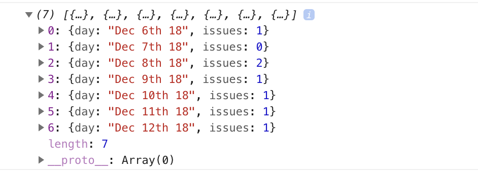
Below is an example of what was logged on the console for the facebook/react repo:

If you start up the Vue dev server using npm run serve and enter some different repos, you should see something similar. If you’re stuck for inspiration, check out GitHub’s Trending page.
Next comes the fun bit — visualizing this data.
Drawing a Bar Chart Using D3
Earlier on, we mentioned that all the drawing will be handled inside a Chart component. Let’s create the component:
touch src/components/Chart.vue
D3 works on SVG elements, and for us to draw anything with D3, we need to have an SVG element on the page. In our newly created component (src/components/Chart.vue), let’s create an SVG tag:
<template>
  <div>
    <svg></svg>
  </div>
</template>
For this particular tutorial, we’ll visualize our data using a bar chart. I picked a bar chart because it represents a low complexity visual element while it teaches the basic application of D3.js itself. The bar chart is also a good intro to the most important D3 concepts, while still having fun!
Before proceeding, let’s update our App component to include the newly created Chart component below the form:
<template>
  <div id="app">
    <form action="#" @submit.prevent="getIssues">
      ...
    </form>

    <chart :issues="issues"></chart>
  </div>
</template>
Let’s also register it as a component:
import Chart from './components/Chart.vue';

export default {
  name: "app",
  components: {
    Chart
  },
  ...
}
Notice how we’re passing the value of the issues data property to the Chart component as a prop:
<chart :issues="issues"></chart>
Let’s now update our Chart component to make use of that data:
<script>
import * as d3 from "d3";
import _ from "lodash";

export default {
  props: ["issues"],
  data() {
    return {
      chart: null
    };
  },
  watch: {
    issues(val) {
      if (this.chart != null) this.chart.remove();
      this.renderChart(val);
    }
  },
  methods: {
    renderChart(issues_val) {
      // Chart will be drawn here
    }
  }
};
</script>
In the above code block, we’re importing D3 and Lodash. We then instantiate a chart data property as null. We’ll assign a value to this when we start drawing later on.
Since we want to draw the chart every time the value of issues changes, we’ve created a watcher for issues. Each time this value changes, we’ll destroy the old chart and then draw a new chart.
Drawing will happen inside the renderChart method. Let’s start fleshing that out:
renderChart(issues_val) {
  const margin = 60;
  const svg_width = 1000;
  const svg_height = 600;
  const chart_width = 1000 - 2 * margin;
  const chart_height = 600 - 2 * margin;

  const svg = d3
    .select("svg")
    .attr("width", svg_width)
    .attr("height", svg_height);
}
Here, we set the height and width of the SVG element we just created. The margin attribute is what we’ll use to give our chart some padding.
D3 comes with DOM selection and manipulation capabilities. Throughout the tutorial, you’ll see lot’s of d3.select and d3.selectAll statements. The difference is that select will return the first matching element while selectAll returns all matching elements.
The post An Introduction to Data Visualization with Vue and D3.js appeared first on SitePoint.
No comments:
Post a Comment