Firstly, the backstory. In 2013 the popular Cook app was launched, and it’s great to reflect on the journey it’s been through.

I love to cook. This is probably not surprising for someone who created a cooking app. As a child, some of my earliest memories are of sitting on the kitchen bench watching my mother cook amazing food for all manner of social events, and getting to help stir or participate in other small ways was a highlight for me.
I really think food holds many memories. The smell of food, or the type of dish you’re eating, can take you back in time — in much the same way music has the ability to trigger memories of different times in your life, reminding you of people and places from your past.
It was the memories of the past that led me to think of a digital recipe book being a good idea for an app.
I was chatting with my mother one day and asked her where my grandmother’s baked custard recipe was. She responded, “Oh, I don’t know. I don’t think she ever wrote it down. She just did it from memory.”
I was horrified. It was a simple recipe. But at the time I asked the question, my grandmother had been dead for ten years. That meant the recipes I recalled from my past — simple though they were — had now been lost with her. My grandmother isn’t any different from many home cooks who have an array of recipes they cook so often they know how to do them from memory, and so never write them down.
Recipes can represent your heritage in many ways. My grandmother’s was a simple recipe, and I could probably easily recreate it from a web search. But this particular recipe held special memories of baked dinners and times spent with my grandmother. Because she didn’t write it down, it was lost now — never to be recovered.
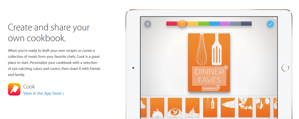
So Cook was first imagined as a way to preserve the heritage of family recipes — helping to overcome the loss of handwritten recipes over time, assisting to preserve recipes from generations of family cooks. By digitizing the old world of index cards, tatty old recipe books, or other random means, my hope was to enable family recipes to be captured and shared with future generations. Digital meant that recipes could be handed down more easily and not lost to a time gone by.
The Opportunity to Do Something Knocks
Like many people who have a killer idea for an app, I did nothing with this idea for ages. I was just another person that imagined a “great idea” for an app and bored people with that idea at dinner parties.
Then, in 2011, SitePoint approached me to write a book on UX.
SitePoint is a publication mainly aimed toward the developer community, so they suggested that a case study would be useful in bringing the value of UX to life for their readers in a more tangible way.
UX has often been viewed with skepticism in terms of tangible, measurable benefit. In those days, it was still kind of new to consider “the user” of a product as you developed it — as crazy as that sounds. So I discussed with my editor Simon the idea for the app, and that we could incorporate the story of it into the UX book.
We imagined that each chapter could talk about the key methods to follow, and that the app would be the living and breathing example of how we put the methods to work in order to bring the app idea to life. In this sense, Cook became the case study for taking a “human-centered design” approach to product design.
So, by writing the book we were able to mature the idea of a recipe app a bit further, taking an educational approach.
The UX Rules of Product Development
Whenever creating a product, you should ask yourself three simple questions:
- What problem needs solving?
- Who are you solving it for?
- How are you going to measure success?
What Problem Needs Solving?
Quite often this gets answered as a product is imagined, and Cook was no different. I was a passionate home cook that thought there was potentially was a gap in the market, based on a pain I had encountered. Although it’s wise to never think you are your users, this is the way many ideas start. And this thought spurred on the idea for a digital recipe book. Exploration of that idea comes next.
As part of the process of exploration, we needed to scan the landscape. What else was out there? Were we the only ones with this idea? How could we be inspired by the competing and complimentary offerings that existed? Had someone else beaten us to it?
This task proved to be a scary one, as we discovered the cooking app landscape was littered with famous celebrity chefs. Jamie and Nigella were everywhere. I was a passionate home chef, but I was no MasterChef. Eeep! However, regardless of the talent in the space, the design gap still remained. There was no app we could find that presented people with a stupidly simple means of creating recipes and storing them digitally. There were many complex ones that were hard to use. And therefore, not only was there a gap, but there was an area that we could easily differentiate — simply by being easy to use.
Who Are We Solving It For?
The problem we were solving for was, to my mind, home cooks. Passionate, average, everyday cooks, the type of people that had their own recipe scrapbook full of favorite recipes from times past. Collected from family and friends over the years.
This focus is why we initially named the app “Family Favorites”. It said what we intended — but it was a bit lame in selling the dream from a marketing perspective, and also tended to pigeonhole the target audience in a way we didn’t want. That is, it seemed to say “families only”.
We knew we had work to do on the name and on giving it a broader appeal. Nevertheless, the placeholder name held for a while as we got on with the business of researching and creating the app. We’d think about the name later.
Measuring Success
Obviously, the easiest measure of success was going to be people downloading it and using it. Actually, creating recipes within the app was going to be the main measure of success at this stage. This measure would change over time as the design and concept evolved, but, at a basic level, if you’re downloading an app and using it, it’s a good basic success metric.
We agonized over whether to charge for the app or not, and we eventually decided we needed eyeballs in the early days. So the app would be free, so that there was no barrier to people downloading it.
What Taking a “UX” Approach Means in Practice
We ate our own dog food and followed a “human-centered design approach” (HCD), or “UX” approach. This approach is more commonly understood and accepted nowadays as a beneficial approach to product development. But what does it mean in practice?
HCD, UX, even service design (SD), are all very similar in their philosophy: that is, to design by putting the human at the center of your design process — considering their needs upfront and throughout the product development process, being prototype-driven (that is, experimental), and iterative (that is, changing your mind and updating the design, based on what you learn from exploration and validation with people). It’s stupidly simple. We did all these things developing Cook. It works.
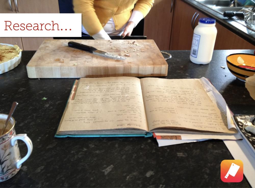
I’ve often told the story of how I recruited people to take part in some concept exploration research before we started designing the app. I did this across a weekend — the only time I could fit it in around work. I told participants I was going to come over to their house, and I wanted them to prepare and cook for me one of their favorite recipe dishes of all time.
Everyone I tell this story to laughs and says the same thing. “Nice one! You just wanted to be fed!”
Without doubt, it was one of the most enjoyable sessions I’ve ever run, and I certainly loved the many and varied outputs. But that was part of the real trick — to ensure they didn’t really know what I was exploring.
From a process perspective, I sent them a homework activity to complete before I got there, so we could talk about it. The homework task was to create a poster that combined words and images to show how they feel about cooking (this helped prime them to the topic). They knew I was going to arrive and chat to them while they prepared the dish, but they didn’t really know what it was I was researching beyond that.
As they prepared the food, I asked them questions about the dish they’d chosen, and watched to see if they used a recipe, and where they had the recipe as a reference. (Was it in a recipe scrap book? Was it in a book? Index cards? From memory? Other?)
I intentionally didn’t talk about storage or recipe management too much. That part I observed. I talked to them mainly about their love of cooking, how they came to find this recipe and how it ended up being a family favorite. I talked about how they came across new ideas for cooking dishes and where they kept things stored. But we didn’t ever talk about whether they thought a “digital recipe app” was a good idea or not.

The trick to good research is to explore around the edges of what you’re looking at, and not let the people you’re talking to necessarily know what you’re actually researching.
You gain real insights from observing people’s true habits and behaviors, rather than by asking direct questions about their habits — which just puts people in a position of making up an answer if they don’t know why they do what they do. Most of the time we don’t know why we do things. We just do them automatically. It’s a habit we’ve formed for some reason, and it serves a particular purpose for us. Exploring the purpose around what we do, and why, is the job of a design researcher.

This comes to another thing about design research: we explore the way users work and live in a more contextual manner, and from that we gain inspiration for design. People often forget the little details of routine, so going into their environment helps us make connections that they might not think to articulate. Design research is intended to explore the design gaps and facilitate a better understanding for how users’ needs can be met — so that we can design better solutions for them.
One of the central tenets of HCD is to go to the extremes. Don’t just engage with people you think you’re creating the product for. Go to the edges and get inspiration from the types of users who might never want to buy your product. The anti-users and the experts often give you the best hints for how your product can differentiate itself and appeal to a broader market.
The people I recruited to participate included passionate home cooks, people who couldn’t cook, people who hated cooking, and professional chefs.
What I Learned that Changed My Thinking
The idea we went into research to create was quite different from what we came out with. We went into concept research absolutely sure we had an opportunity to create a digital recipe cookbook that people could store their recipes within. The ability to be digital meant cherished recipes would never be lost, and you could keep adding to your digital cookbook indefinitely.
What we missed with this perspective, however, was the gap for sharing and swapping recipes. And we also totally underestimated people’s voyeuristic, idle curiosity about what other people cook and eat from day to day.
It’s funny. I’m a passionate home cook. But I was so focused on what I thought the product needed to be that I totally overlooked many things that user research helped me open my eyes to and refocus on. In this sense, my own bias about the product made me overlook critical product features that would help make the app really special.
This points to a few things about research.
- As a human, you have a lot of biases and self-fulfilling tendencies when creating a product you’ve been personally invested in. You really need to watch that. It’s part of being human, and hard to control. Being aware of it and testing your assumptions with real people other than you is critical.
- As a design researcher, you have to be open to changing your mind about what you think you know to be true. This is product design, not art. The purpose of design is to ensure it’s as good as it possibly can be for the eventual end users. You need to accept that your initial wonderful idea might not have it all covered. You need to change your mind, and your design approach, based on what you learn. Otherwise, you’re just creating art.
This self-reflective moment is essential for design researchers. Your humble attitude to being open to new ideas, and changing your design accordingly, is not only essential, it’s critical to your success.
The Critical Aha Moments
People who love to cook often are friends with other people who love to cook. Swapping and sharing recipes is something they do. But as we learned, it’s a difficult and messy process.
This was the first aha moment. When we unpacked the research, we realized we needed to make Cook more than just a digital recipe book. We needed to facilitate sharing. It needed to be a social network for recipe sharing — enabling you to connect with friends and family and access each other’s recipes.
Another aha moment was discovering that people were fascinated by what other people cooked and ate. Not the exotic or highly skilled cheffy stuff, but the everyday meals that were quick and easy were interesting to people. Ultimately, they wanted inspiration for their everyday. But it had to be quick and simple — things that didn’t take too long. They were curious about what other people were doing in the kitchen on week nights, when they were pushed for time and were preparing for the week ahead.
Another critical aha moment was that people’s voyeuristic food tendencies weren’t limited to the banality of the local day-to-day. They were interested in the day-to-day food from other cultures. We discovered that many people attend cooking courses and buy recipe books from countries they visit. And while they’re interested in the exotic and higher-brow stuff, they’re also interested in the day-to-day. This opened our eyes to the prospect of a global recipe sharing network, which would facilitate users seeing what everyday cooks in other countries cooked regularly.
This led to two things: we launched the app globally, rather than just in Australia, and we partly focused recipe browsing on where recipes were submitted from. So one of the main navigation features was the “world books”, which allowed you to see what the everyday cooks in the UK, or USA, or Singapore were cooking.
This may seem like a little thing, but to me this really was one of the coolest features of Cook. Yes, people in the USA have an inordinate amount of Oreo Cookie recipes to share, and people in Italy have an amazing stash of pasta dishes.
Another aha moment was considering how to assist users to “fill up” their recipe book without having to actually write out recipes. People who had recipe scrap books had been adding to them for years — and still they might not have had many recipes within them. This was a concern for us. For Cook to be successful, you needed to be able to have it all, and it needed to be super simple.
We knew that searching the Web was a common way to find recipes. So the need to search the Web for recipes and add them to your book was clear, but another way to help build out your book was to be able to add recipes you found within Cook, from across the global selection. This helped to save the things you loved as your own, and also helped to fill out your book quickly and easily.
These things may not appear to be much. But they were a fundamentally different way to design and build out the app. And we were able to then do these things because we did this research up-front, before we had started to build or lay down foundations that were going to be hard (or impossible) to change. We were letting what we’d learned reshape our thoughts of the Cook app, which was a great position to be in.
Where We Are Now
Cook launched in 2013, a year after the launch of the book Killer UX Design, and I’m pleased to say we’re still rated one of the top 20 best apps for the food and drink category.

We’ve had 1.5 million downloads to date, and there have been 800 thousand recipes shared through the app worldwide.
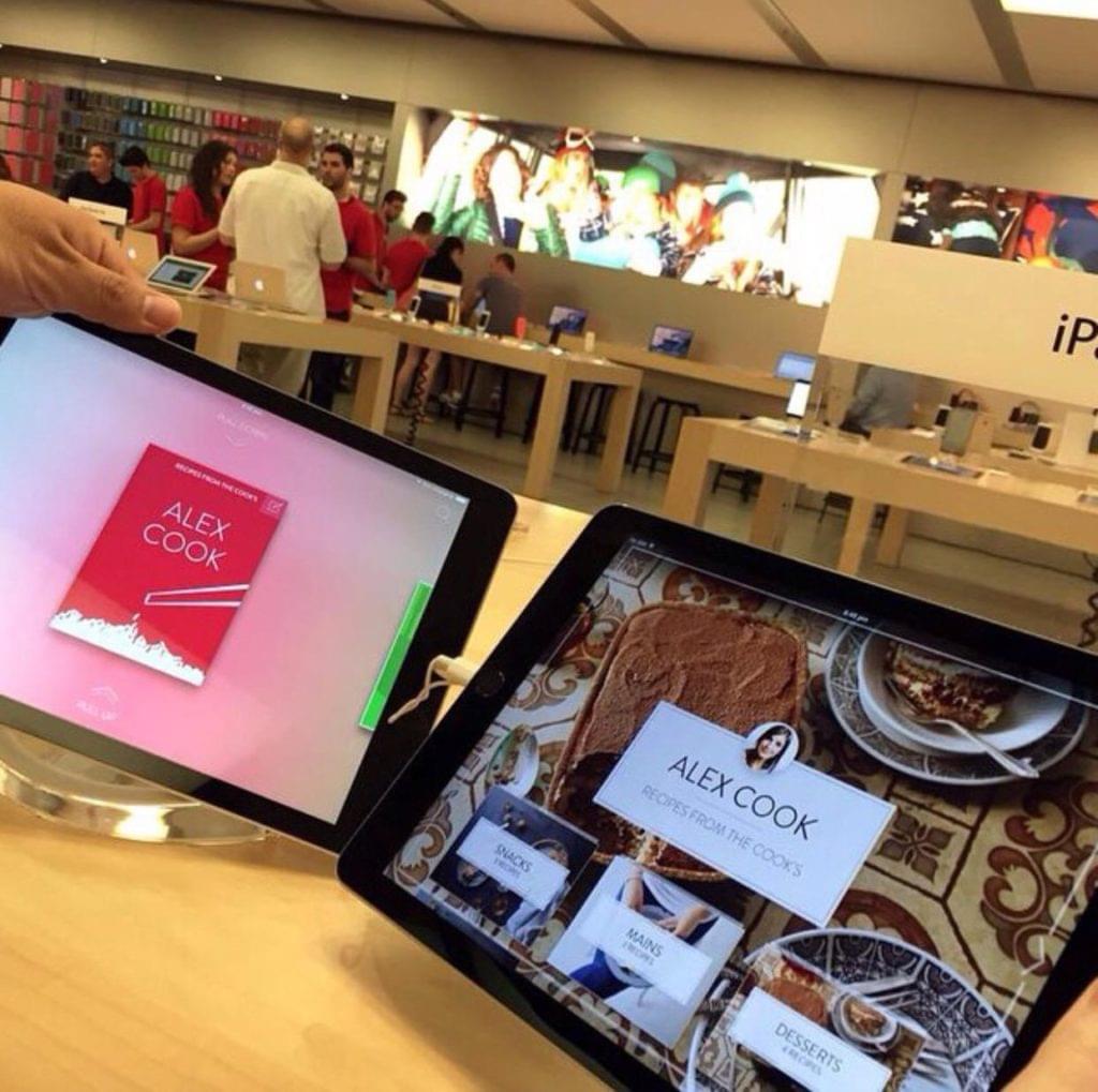
Cook is featured on iPads in the Apple store around the world. In fact, I’ll never forget going into the Apple store in NYC and seeing Cook on the iPads on display. Wow! What a thrill that was.

The app has many dedicated users who love and cherish their digital cookbook. I don’t think I could have dreamed of a happier ending.
Like all start-ups, we always managed Cook on the side of our day jobs. And it’s the same right now. We’ve never received any funding and have been keeping the dream alive through our dedicated community of Cooks, who create and share content via the app daily.
We never did change the charging model, so to date, Cook has brought us lots of grateful moments, but no money. As we mentioned, we decided to remove all barriers for download and therefore not to charge for the app. To this day the app is free — an expensive decision, but the right one at that time.
The funniest thing about apps is that you ask someone to go to a different bank ATM and pay $3 to extract money and no one batts an eyelid. You ask someone to pay $3 for an app and they’re up in arms! And so not charging for Cook is something we’re going to reconsider.
It’s certainly hard sometimes for people who use Cook to understand that there are only about two people overseeing that app. So right now I’m looking for funding to keep Cook going into the future — a true labor of love.
Working with Cook has been a design experience of a lifetime, and one that totally validates the HCD approach we set out to prove.
The post How User Research Turned a Good App into a Great One appeared first on SitePoint.
No comments:
Post a Comment