The following introduction to CSS Grid is an extract from Tiffany’s upcoming book, CSS Master, 2nd Edition, which will be available shortly.
CSS Grid is a relatively recent layout specification, shipping in most browsers as of October 2017. Grid allows us to create layouts that were previously impossible, or only possible with lots of DOM operations.
Keep in mind that the CSS Grid specification is dense, and introduces several new concepts that are quite complex. Consider this an overview rather than a comprehensive look at Grid. Don’t worry, we’ll point you to lots of resources for learning more.
The Grid Formatting Context
Adding display: grid to an element triggers a grid formatting context for that element and its children. In a grid formatting context, three things happen:
- The element becomes a block-level element that participates in the normal flow.
- Its children—whether elements or text nodes—create block-like, grid-level boxes that can be arranged into rows and columns. Immediate children of a grid container are grid items.
- In a horizontal writing mode, each member in a grid row will have the same height as its tallest element (as determined by content), unless an explicit height value is set. When the document uses a vertical writing mode, it takes on the same length as its longest element (as determined by content).
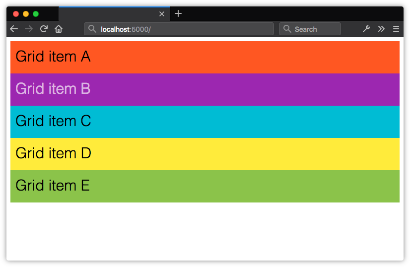 Using display: grid creates a block-level container, and block boxes for its children
Using display: inline-grid works similarly. Children of inline-level grid containers create grid-level boxes, but the container itself participates in an inline formatting context.
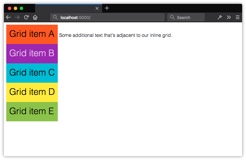 Using display: inline-grid creates an inline-level box for the container, but block boxes for its children
By themselves, display: grid and display: inline-grid won’t automatically arrange these boxes into rows and columns. We also need to tell the browser where and how to place things.
Before creating your grid, determine whether you want a fixed number of columns and/or rows, whether you’d like the browser to calculate the number of columns and rows automatically, or whether you’d like a mix of the two. Knowing what kind of grid you want to create determines the approach you’ll take. Let’s look at a few techniques.
Defining a Grid Layout
After defining a grid container, we’ll need to tell the browser how many rows and columns our grid should contain. We can define the number of rows and columns using the grid-template-rows and grid-template-columns properties. They’re applied to the grid container.
Both grid-template-rows and grid-template-columns accept what’s known as a track list. The track list is a space-separated string that specifies grid line names and sizes of each position in the row or column.
Each value in a track list creates a new space—a track—within the row or column. You can use lengths, flexible length units (discussed later in this chapter), or percentages. You can also use sizing values such as auto, min-content and max-conent.
.grid {
    display: grid;
    grid-template-columns: 25rem 25rem 25rem;
    grid-template-rows: 10rem 10rem;
}
In the code above, we’ve defined a grid with three columns, each 25rem units wide and two rows, each 10rem units tall. Let’s apply it to the following HTML. Yes, this is all the markup required:
<div class="grid">
    <div>Grid item A</div>
    <div>Grid item B</div>
    <div>Grid item C</div>
    <div>Grid item D</div>
    <div>Grid item E</div>
</div>
Our grid items get organized into the columns and rows shown below.
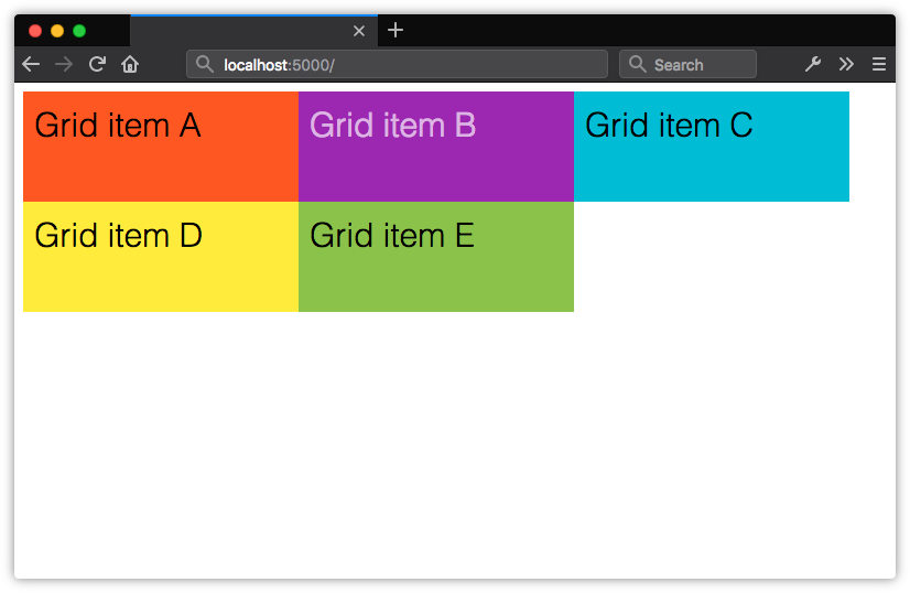 Creating an explicit grid with grid-template-columns and grid-template-rows
Here, we’ve created a grid of evenly sized rows and columns, but that isn’t a requirement of Grid. Let’s tweak our CSS slightly. We’ll change the value of grid-template-columns to 25rem 15rem 25rem:
.grid {
    display: grid;
    grid-template-columns: 25rem 15rem 25rem;
    grid-template-rows: 10rem 10rem;
}
Now the second column in our grid is narrower than the first and third.
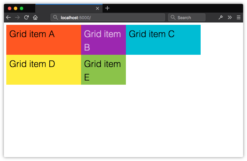 Grid columns and rows don’t have to be the same width
Explicit Grid versus Implicit Grids
In the previous section, we explicitly stated that this grid should have six available grid cells formed by three columns and two rows. This is what’s known as an explicit grid. Here, our grid container only has five children. The remaining position is empty. Let’s see what happens when we add more children to the container.
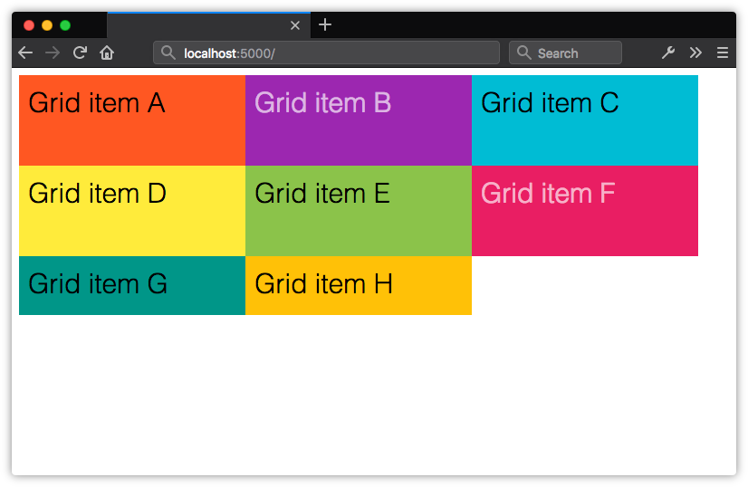 When grid items exceed the number of explicitly defined cells, the remaining items are arranged in an implicit grid
Now we have three rows. Notice, however, that our third row is only as tall as its contents and padding. It’s part of the grid because these items are the children of a grid container. Yet the row isn’t explicitly defined by grid-template-rows. What we have instead is an implicit grid—an explicit grid with additional grid items that exceed the defined number of explicit grid cells.
Items within an implicit grid are auto sized by default. Grid items will expand to accommodate their contents, or fill the remaining vertical space in the container—whichever is taller. If, for example, we set the height property of our container to 50rem, our implicit grid track will expand to be 30rem tall.
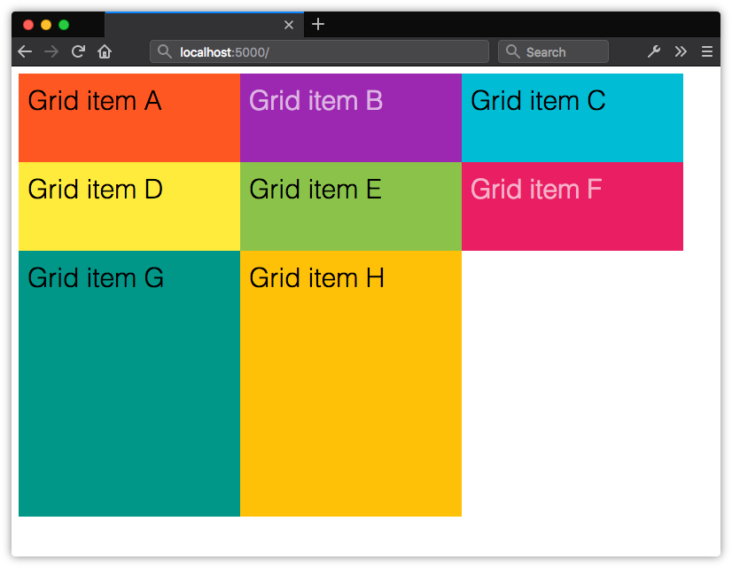 Implicit grid rows expand to fill the available height of the container
If we add enough items to create a fourth row, the height of our implicit grid items will be distributed evenly across the remaining 30rem of vertical space in the container. Their computed height will be 15rem each.
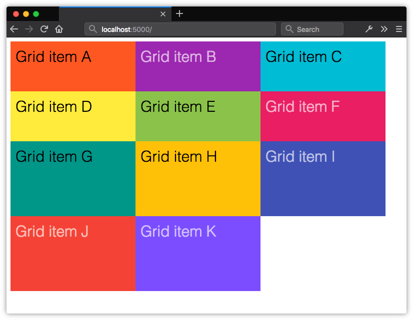 The height of implicit grid rows will be evenly distributed based on the remaining space in the grid container
In our original example, we’ve explicitly defined only two rows with a height of 10rem each, so our third row defaults to auto sizing. Its height will adjust to the size of its contents and padding.
The post Creating Layouts with CSS Grid appeared first on SitePoint.
No comments:
Post a Comment