
Thursday, 12 December 2019
Russian Police Raided NGINX Moscow Office, Detained Co-Founders
Russian law enforcement officers have raided the Moscow offices of Nginx—the company behind the world's second most popular web server software—over a copyright infringement complaint filed by Rambler, a Russian Internet portal and email service provider. According to multiple reports from local media and social media, the police conducted searches and has also detained several employees of

Major Trends in Cyber Security to Expect in 2020
The discussions on cybersecurity and cyber threats gain more and more recognition as we advance the progress and transfer even
Major Trends in Cyber Security to Expect in 2020 on Latest Hacking News.
The Evolution of JavaScript Tooling: A Modern Developer’s Guide

This article was created in partnership with Sencha. Thank you for supporting the partners who make SitePoint possible.
JavaScript application source code has traditionally been hard to understand, due to code being spread across JavaScript, HTML, and CSS files, as well as events and data flowing through a number of non intuitive paths. Like all software, the JavaScript development environment includes bundlers, package managers, version control systems, and test tools. Each of these requires some learning curve.
Inconsistencies and incompatibilities between browsers have historically required various tweaks and special cases to be sprinkled around the code, and very often fixing a bug in one browser breaks something on another browser. As a result, development teams struggle to create and maintain high quality, large-scale applications while the demand for what they do soars, especially at the enterprise-application level where business impact has replaced “How many lines of code have you laid down?”
To deal with this complexity, the open-source community as well as commercial companies have created various frameworks and libraries, but these frameworks and libraries have become ever more complicated as they add more and more features in an attempt to make it easier for the developer. Still, frameworks and libraries offer significant advantages to developers and can also organize and even reduce complexity.
This guide discusses some of the more popular frameworks and libraries that have been created to ease the burden of writing complex user interface (UI) code and how enterprise applications, especially data-intensive apps, can benefit from using these frameworks and UI components to deliver applications faster, with better quality, and yet stay within any development shop’s budget.
Complexity of Modern Web Development
Andrew S. Tanenbaum, the inventor of Minix (a precursor to Linux often used to bring up new computer chips and systems), once said1, “The nice thing about standards is that you have so many to choose from.” Browsers followed a number of standards, but not all of them, and many just went their own way.
That’s where the trouble started — the so-called “Browser Wars.” How each browser displayed the data from these websites could be quite different. Browser incompatibilities still exist today, and one could say they are a little worse because the Web has gone mobile.
Developing in today’s world means being as compatible as possible with as many of the popular web browsers as possible, including mobile and tablet.
What about mobile?
Learning Android Java (Android) can be difficult if the developer hasn’t been brought up with Java. For Apple iOS, Objective C is a mashup of the C programming language and Smalltalk, which is different but not entirely alien to C++ developers. (After all, object-oriented concepts are similar.) But given the coming of (Apple) Swift and a new paradigm, “protocol-oriented programming,” Objective C has a questionable future.
In contrast, the JavaScript world, through techniques such as React Native or Progressive Web Apps, allows for development of cross-platform apps that look like native apps and are performant. From a business perspective, an enterprise can gain a number of advantages by only using one tool set to build sophisticated web and mobile apps.
Constant change causes consternation
The JavaScript world is particularly rich in how much functionality and how many packages are available. The number is staggering. The number of key technologies that help developers create applications faster is also large, but the rate of change in this field causes what’s called “JavaScript churn,” or just churn. For example, when Angular moved from version 1 to 2 (and again from 3 to 4), the incompatibilities required serious porting time. Until we embrace emerging Web Components standards, not everything will interoperate with everything else.
One thing that can be said is that investing in old technologies not backed by standards can be career-limiting, thus the importance of ECMA and ECMAScript standards as well as adherence to more or less common design patterns (most programming is still, even to this day, maintenance of existing code rather than fresh new starts and architectures). Using commonly used design patterns like Model-View-Controller (MVC), Model-View-Viewmodel (MVVM), and Flux means that your code can be modified and maintained more easily than if you invent an entirely new paradigm.
Having large ecosystems and using popular, robust, well-supported tools is one strategy proven year after year to yield positive results for the company and the developer’s career, and having industry-common or industry-standard libraries means that you can find teammates to help with the development and testing. Modern development methodologies practically demand the use of frameworks, reusable libraries, and well-designed APIs and components.
Popularity of Modern Frameworks and Libraries
Stack Overflow, an incredibly popular developers website used for questions and answers (#57 according to Alexa as of January 2019), tracks a great deal of data on the popularity of various technologies and has become a go-to source for developers. Their most recent survey continued to show the incredible popularity of both JavaScript and JavaScript libraries and frameworks:
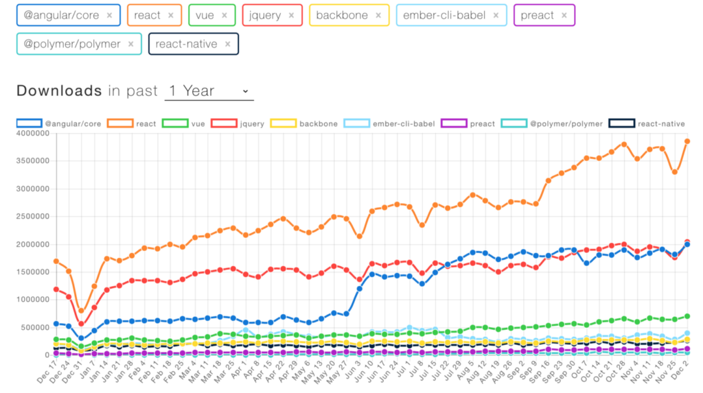 NPM Downloads of Popular Frontend Libraries. (Source)
According to Stack Overflow, based on the type of tags assigned to questions, the top eight most discussed topics on the site are JavaScript, Java, C#, PHP, Android, Python, jQuery and HTML — not C, C++, or more exotic languages like Ocaml or Haskell. If you’re building websites, you’re very likely going to want to use technologies that are popular because the number of open-source and commercial/supported products provides you with the ability to code and test more quickly, resulting in faster time to market.
What this means to developers is that the JavaScript world continues to lead all others in the number of developers, and while older technologies like jQuery are still popular, clearly React and Angular are important and continue growing. The newcomer, Vue, is also becoming more and more popular.
Selecting Angular, React, or Vue
Angular versus React versus Vue — there are so many open-source tools. Add to that libraries like Backbone.js and a hundred others. How can developers update their knowledge of so many? Which one should they choose? To some extent this decision is choosing text editors: it’s a personal choice, it’s fiercely defended, and in the end each might actually work for you.
If your main concern is popularity so you don’t get boxed into learning a complicated, rich programming environment only to see support wither away, then React is clearly “winning” as the long-term trend line shows. But popularity is only one attribute in a long shopping list of important decision factors.
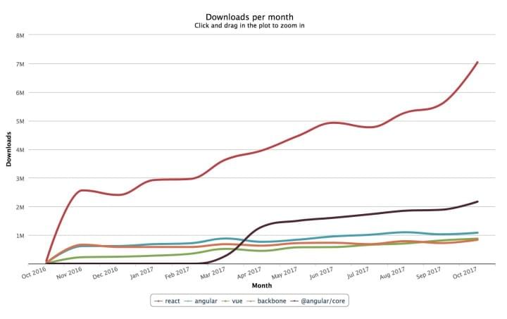 Long-term trend lines of various popular frameworks and libraries. (Source)
The post The Evolution of JavaScript Tooling: A Modern Developer’s Guide appeared first on SitePoint.
Chrome now warns you if your password has been stolen
The browser’s latest version also aims to up the ante in phishing protection
The post Chrome now warns you if your password has been stolen appeared first on WeLiveSecurity

OSINT tutorial to Find Information using a Phone Number – PhoneInfoga Tool
Phone number plays a vital role in the social...
[[ This is a content summary only. Visit my website for full links, other content, and more! ]]
[[ This is a content summary only. Visit my website for full links, other content, and more! ]]
Understanding and Using rem Units in CSS

CSS units have been the subject of several articles here on SitePoint (such as A Look at Length Units in CSS, The New CSS3 Relative Font Sizing Units, and The Power of em Units in CSS). In this article, we increase the count by having an in-depth look at rem units, which have excellent browser support and a polyfill if you need support for old IE.
This article was updated in December, 2019 to reflect the current state of rem unit sizing with CSS. For more on CSS font and text properties, read our book, CSS Master, 2nd Edition.
What Are rem Units?
You might have encountered the term “R.E.M.” before while listening to the radio or your music player. Unlike their musical counterparts, named for the “Rapid Eye Movement” during deep sleep, in CSS rem stands for “root em”. They won’t make you lose your religion nor believe in a man on the moon. What they can do is help you achieve a harmonious and balanced design.
According to the W3C spec the definition for one rem unit is:
Equal to the computed value of
font-sizeon the root element. When specified on thefont-sizeproperty of the root element, the rem units refer to the property’s initial value.
This means that 1rem equals the font size of the html element (which for most browsers has a default value of 16px).
Rem Units vs. Em Units
The main problem with em units is that they are relative to the font size of their own element. As such they can cascade and cause unexpected results. Let’s consider the following example, where we want lists to have a font size of 12px, in the case where the root font size is the default 16px:
[code language="css"]
html {
font-size: 100%;
}
ul {
font-size: 0.75em;
}
[/code]
If we have a list nested inside another list, the font size of the inner list will be 75% of the size of its parent (in this case 9px). We can still overcome this problem by using something along these lines:
[code language="css"]
ul ul {
font-size: 1em;
}
[/code]
This does the trick, however we still have to pay a lot of attention to situations where nesting gets even deeper.
With rem units, things are a simpler:
[code language="css"]
html {
font-size: 100%;
}
ul {
font-size: 0.75rem;
}
[/code]
As all the sizes are referenced from the root font size, there is no more need to cover the nesting cases in separate declarations.
Font Sizing with Rem Units
One of the pioneers of using rem units for font sizing is Jonathan Snook with his Font sizing with REM article, back in May, 2011. Like many other CSS developers, he had to face the problems that em units bring in complex layouts.
At that time, older versions of IE still had large market shares and they were unable to zoom text that was sized with pixels. However, as we saw earlier, it is very easy to lose track of nesting and get unexpected results with em units.
The main issue with using rem for font sizing is that the values are somewhat difficult to use. Let’s see an example of some common font sizes expressed in rem units, assuming, of course, that the base size is 16px:
- 10px = 0.625rem
- 12px = 0.75rem
- 14px = 0.875rem
- 16px = 1rem (base)
- 18px = 1.125rem
- 20px = 1.25rem
- 24px = 1.5rem
- 30px = 1.875rem
- 32px = 2rem
As we can see, these values are not very convenient for making calculations. For this reason, Snook used a trick called “62.5%“. It was not a new discovery, by any means, as it was already used with em units:
[code language="css"]
body { font-size:62.5%; } /* =10px */
h1 { font-size: 2.4em; } /* =24px */
p { font-size: 1.4em; } /* =14px */
li { font-size: 1.4em; } /* =14px? */
[/code]
As rem units are relative to the root element, Snook’s variant of the solution becomes:
[code language="css"]
html { font-size: 62.5%; } /* =10px */
body { font-size: 1.4rem; } /* =14px */
h1 { font-size: 2.4rem; } /* =24px */
[/code]
One also had to take into account the other browsers that didn’t support rem. Thus the code from above would have actually been written this way:
[code language="css"]
html {
font-size: 62.5%;
}
body {
font-size: 14px;
font-size: 1.4rem;
}
h1 {
font-size: 24px;
font-size: 2.4rem;
}
[/code]
While this solution seems to be close to the status of a “golden rule”, there are people who advise against using it blindingly. Harry Roberts writes his own take on the use of rem units. In his opinion, while the 62.5% solution makes calculation easier (as the font sizes in px are 10 times their rem values), it ends up forcing developers to explicitly rewrite all the font sizes in their website.
The post Understanding and Using rem Units in CSS appeared first on SitePoint.
Wednesday, 11 December 2019
New Zeppelin Ransomware Targeting Tech and Health Companies
A new variant of Vega ransomware family, dubbed Zeppelin, has recently been spotted in the wild targeting technology and healthcare companies across Europe, the United States, and Canada. However, if you reside in Russia or some other ex-USSR countries like Ukraine, Belorussia, and Kazakhstan, breathe a sigh of relief, as the ransomware terminates its operations if found itself on machines
Subscribe to:
Posts (Atom)